Corktown Printing

APT Living

Apt Logo circle

The re-imagining of a legacy Vancouver rental tower required a fresh brand to communicate a whole new style of urban living – 150 square-foot suites, but with common amenities areas and an all-inclusive price. Unicycle Creative handled strategy, naming and graphic design (with New Collider Creative) Read the full case ...

Lightworks

Working with Vancouver advertising agency The Watershed Group, Unicycle Creative helped with naming and brochure design for this unique commercial development. This iconic industrial building, once home to an electronics factory that made components for WWII, was redeveloped as a manufacturing/tech hub. Its Art Deco facade was retained, along with ...

21 Doors

The Salient Group is a visionary Vancouver developer who was tasked with marketing the redevelopment of a unique property on the east edge of Gastown. Unicycle Creative helped name the project and developed all marketing materials. A Gastown photo shoot, with photographer Arno Apeldoorn, provided a library of B&W images ...

Hemlock Thought Box

Many clients who use print only do so on an irregular basis. That’s why it is important for printers to maintain top-of-mind awareness. Hemlock Printers wanted to do this with a unique giveaway – a big block-stack of notes. Unicycle Creative imagined this as a big box of thoughts… rendered ...

Hemlock Print & a Pint Series

How do you get busy designers and clients to learn more about new printing technology? Buy them beer, of course. Unicycle Creative helped design and create this brand for Hemlock Printers, and now the event has grown to international stature with events in Vancouver and Seattle. Guest speakers mini trade ...

Runningreen – Eco printing Infoforum

This Hemlock Printers sponsored event featured highly qualified speakers and breakout audience interaction sessions focused on sustainable printing issues. Unicycle developed the Runningreen name and identity, and designed a print invitation and animation for the web response page, featuring a chainsaw-wielding tree. The event sold out.

The Core

Unicycle was engaged for naming and design for this climbing, yoga and fitness centre at the heart of Whistler Village. ‘The Core’ communicates aspects of fitness and strength common to all the gym’s activities. It also refers to the underground location of the facility, and conveys the purity of purpose ...

NameTag™ Print Response Marketing

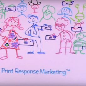
Merging the worlds of online and print media, Hemlock Printers offers a printing solution that combines personalization with a sophisticated web response system. NameTag™ Print Response Marketing was the identity we provided, to describe both the customer name customization and the online response page ‘tag’ that gives the system its ...

This is a unique website which will require a more modern browser to work!

Please upgrade today!