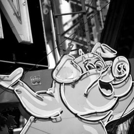
The Salient Group is a visionary Vancouver developer who was tasked with marketing the redevelopment of a unique property on the east edge of Gastown. Unicycle Creative helped name the project and developed all marketing materials. A Gastown photo shoot, with photographer Arno Apeldoorn, provided a library of B&W images ...

Many clients who use print only do so on an irregular basis. That’s why it is important for printers to maintain top-of-mind awareness. Hemlock Printers wanted to do this with a unique giveaway – a big block-stack of notes. Unicycle Creative imagined this as a big box of thoughts… rendered ...

New Yorker Jacquline Ottman is an icon and an innovator in the world of sustainability marketing. She has now created WeHateToWaste.com, an online portal for the promotion of zero waste lifestyles and policy. To help brand and promote this site, Unicycle Creative provided a series of Lorne Craig cartoon illustrations ...

How do you get busy designers and clients to learn more about new printing technology? Buy them beer, of course. Unicycle Creative helped design and create this brand for Hemlock Printers, and now the event has grown to international stature with events in Vancouver and Seattle. Guest speakers mini trade ...

This Hemlock Printers sponsored event featured highly qualified speakers and breakout audience interaction sessions focused on sustainable printing issues. Unicycle developed the Runningreen name and identity, and designed a print invitation and animation for the web response page, featuring a chainsaw-wielding tree. The event sold out.

Unicycle was engaged for naming and design for this climbing, yoga and fitness centre at the heart of Whistler Village. ‘The Core’ communicates aspects of fitness and strength common to all the gym’s activities. It also refers to the underground location of the facility, and conveys the purity of purpose ...

Started as a wacky idea by Steve Unger, this event asked Vancouverites to find weird, wonderful and carbon-friendly ways to get to work one day out of the year. The logo was my brain run amok at 2am. For the first year’s video we followed Steve on a dry run ...

This Canadian water technology company was evolving to address a worldwide need and international sales opportunities for their ion-based clean water technology. They needed a new name that would be fresh, singular, inspiring and global in scope. Through an inclusive branding process, we created OCION – a name that delivers ...

Vancouver band The Bent Nails have been performing their unique blend of roots and blues at local venues for years. To launch their CD debut, Just Arrivin’, we worked with photographer Clinton Hussey and a borrowed 1947 Chrysler Town & Country sedan to create iconic road blues imagery, used on ...

Hemlock Printers’ successful Print & a Pint Series continues, with a sold-out event held at Vancouver’s waterfront Tap & Barrel restaurant. The invitation was designed as a package, promoting the compact, all-in-one mini-print-tradeshow format of the event. Printed digitally on reflective stock, the design uses digital opaque white to set ...